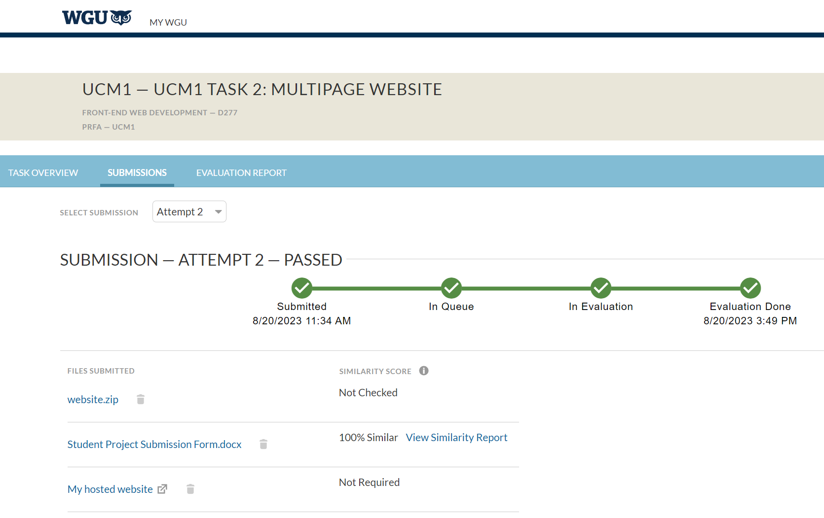
I passed my second course from WGU, which was Front-End Web Development (D277)! Finally! After working on my assignment for almost two weeks, I got done with it today and submitted it for evaluation. It took a few hours but it came back with a successful passing score. I am finally done with this class. I can finally celebrate. It wasn’t really that bad, just time consuming and a lot of tedious work.
I learned a lot from it though. I already knew HTML and CSS, but I had never really worked on a full project like that. If you want to see the final result, you can see my website here.
The task was to create a site about a US state with data about a few of its cities, such as population, region, and average income level compared to the rest of the state. That part was easy. Just had to research the stats online by looking at the census data. However, the main thing was to make the site responsive so that it could scale and look good at any size.
That part took me a little while longer to do. I had to sharpen my HTML/CSS skills and also learn a little bit of JavaScript. Implementing responsive design was fairly difficult for me since I am still new to the whole concept of adapting to different screen sizes. I overused media queries A LOT but I also learned a couple of neat tricks that I will use in the future.
The state I chose was New Jersey, my home state.
The cities I chose were New Brunswick, Ocean City, Hoboken, and Atlantic City.
Fun fact, I’ve only actually been to Ocean City and Atlantic City and that was when I was a teenager. The census data from this source gave me everything I needed to get the average income level for each city. After that, it was just a matter of creating the HTML to display the pages correctly. A couple of things that the assignment rubric demanded were:
- A header in every page
- A navigation bar in every page
- An aside element in every page
- A title that described the web page’s topic
- A relevant image, including relevant alternative text for the image
- A section or sections to divide the content
- An HTML-coded ordered list with at least three list items
- An HTML-coded unordered list with at least three list items
- An HTML-coded table consisting of 3–6 columns and 3–6 rows to organize content
- An external CSS file for appropriate styling of the website
Those were the things I needed to check off my list and I created everything based on that rubric. After creating all of the necessary pages and styling everything to look pretty, it was only a matter of making the site responsive. This is where I struggled. Responsive design was not my forte coming into this class. As I mentioned previously, I had never actually worked on a responsive layout before. Learning it took me weeks and if I’m being honest I still need to get more familiar with it with supplemental material.
After using media queries and a fluid layout, plus some relative units for things like font-sizes, I was able to get my website built for mobile first, and then work my way up to bigger and larger resolutions such as my desktop. It’s important to note that the mobile-first approach is actually recommended by most web developers, but perhaps some may disagree with that implementation.
Two weeks later, I submitted my project and it failed to pass. I was bummed. What had I done wrong? Luckily, it had only failed because I had missed adding an aside to every page (one or two pages were missing an aside element). I simply added the asides as a sidebar with social links and resubmitted my assignment. A few days later, I got my passing score.
So how do I feel about this class? I feel like if you’re new to HTML/CSS or just web design in general, it’s a good first starter class. For me, it was more about refreshing my memory and getting acquainted with being able to make my site responsive.
I will definitely grab some courses from Udemy on CSS and responsive design so that I can grasp it a little better. The next class is JavaScript Programming (D280). Wish me luck!
Last Modified: December 3, 2023


Leave a Reply